Modern Restaurant Menu Template
Characteristics
- Screen formatLandscape 16:9
- Template resolution1280 × 724 px
- Color paletteWarm white, graphite, and pale blue
- Screen formatLandscape 16:9
- Template resolution1280 × 724 px
- Color paletteOff-black, bone, and silver grey
- Screen formatPortrait 9:16
- Template resolution1280 × 2264 px
- Color paletteOat, forest, and pale copper
- Screen formatLandscape 16:9
- Template resolution1280 × 724 px
- Color paletteSand, terracotta, and stone grey
- Screen formatPortrait 9:16
- Template resolution1280 × 2264 px
- Color paletteNear-black, brushed gold, and ash
- Built forRestaurant
- AI customization
- POS price syncSyncs with Toast, Square, Clover
- Paper or screenAvailable as a print-ready download or an automated digital display.
- Automated managementAuto-switches this Modern Restaurant Menu by daypart and pushes price updates — no manual republishing.
- Template priceFree
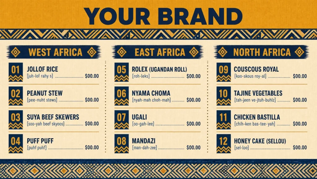
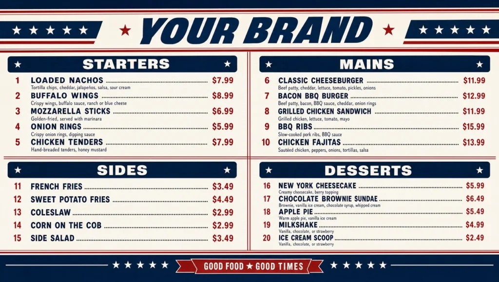
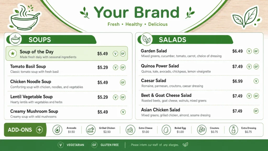
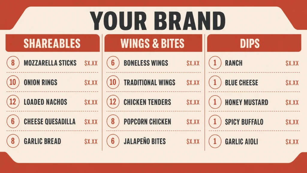
Modern is mostly subtraction. A modern restaurant menu is not a new typeface dropped onto an old layout — it is the same food with the borders gone, the drop shadows gone, the clip-art gone, one typeface instead of three, and enough empty space around each line that the eye stops at the dish rather than at the decoration. That is also why modern menus fail more often than ornate ones: with nothing to hide behind, a crooked margin shows. Four sections, sixteen lines, and one modern menu template read five ways in the 2026 set.
The baseline is warm white and graphite at 1280×724: one weight for names, one for prices, a hairline between sections and nothing else. If you only ever use one of these, use this one — it is the version that survives being printed, screenshotted and projected without falling apart.
What happens if you take the price column out entirely? The off-black and bone build, 1280×724, answers that. Price sits in the same line as the dish, separated only by space, no dotted leaders and no right-hand rail. It is the modern restaurant menu design most upscale rooms ask for, and the one that needs the most discipline about dish-name length.
Turned vertical at 1280×2264, oat and forest sets the section heads sideways down the left edge and runs the food as one uninterrupted column. Good for a narrow panel beside a door, and the only build here where the section names are decoration as much as navigation.
A smaller room needs fewer decisions. Sand and terracotta, 1280×724, narrows the whole thing to two sections with wider leading and a single accent rule — a modern cafe menu design, not a restaurant list pretending to be one.
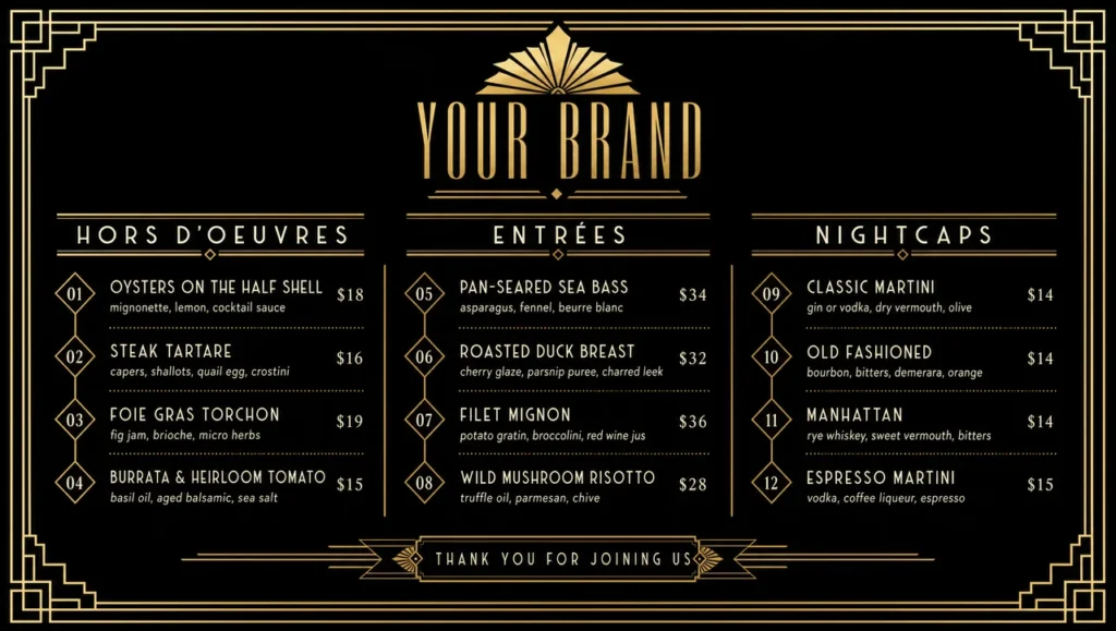
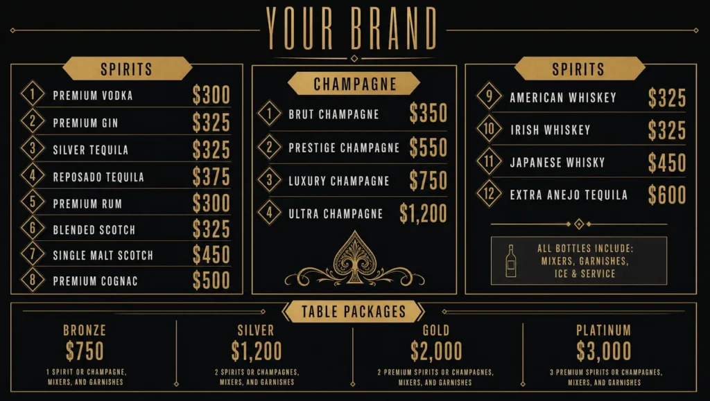
Low light changes everything. The near-black and brushed gold build, 1280×2264, is the modern bar menu design: short list, type two steps larger than anywhere else in the set, readable at arm’s length with the house lights down. It doubles as the closest thing here to a modern elegant menu design.
Everything is editable — section names, dishes, descriptions, prices, and the accent colour carrying the design. If you are working through modern menu design ideas, treat these as modern restaurant menu design examples rather than finished modern restaurant menus: the differences between them are margin, weight and contrast, and those three decisions make or break a clean menu layout. A contemporary restaurant menu holds up longer than a decorated one, which is the practical argument for all of it. More restaurant menu design templates sit beside this one, the wider library has other ways to design menus, and prices track the till through the same connection behind the restaurant menu boards running a single list across several rooms.
Setup Complexity
| Complexity level | Level 4 of 5 |
|---|---|
| Difficulty | Detailed |
| Sections | 4 |
| Menu items | 16 |
| Estimated time | ~4 min |
Want a Modern Restaurant Menu in a different format?
Want a different modern build?
Tell us how many sections you run and whether the room is bright or dark, and get a custom modern restaurant menu ready to edit.