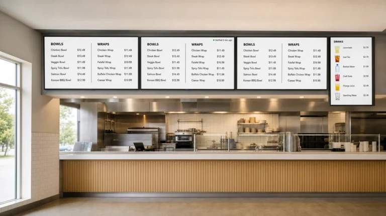
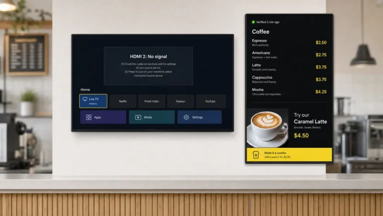
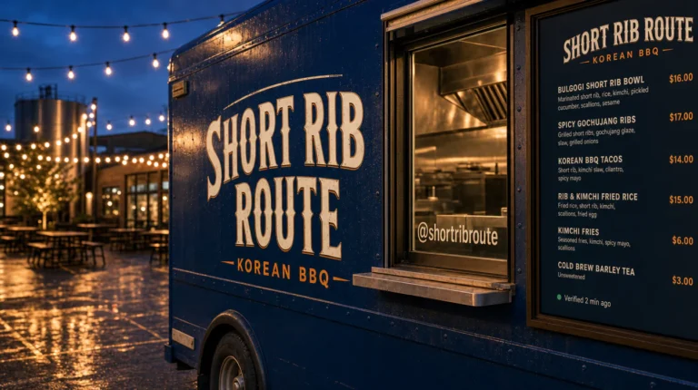
Menu Board Size: How Big, How High, and How Large the Text Should Be



Menu board size starts from the farthest guest who reads a price: an inch of capital-letter height per 10 feet between that guest and the board. In practice, 43-inch screens serve lines up to about 12 feet and 55-inch up to about 25, mounted 6.5–7 feet to the bottom edge, with a 1920×1080 canvas per screen. Next come charts that fit it to your wall.
Menu Board Size by Viewing Distance: The Short Answer
Menu board size follows the farthest guest: every 10 feet of viewing distance needs 1 inch of letter height. Measure to the spot that the back of a normal lunch line reaches, not to the register. That one number sets the letter height, and the letter height decides how many items each screen can carry and how large the screen has to be.
| Farthest guest | Letter height | Screen per position | Items per column | Typical spot |
|---|---|---|---|---|
| 6 ft | 0.6″ | 32–43″ | 12–16 | Pickup shelf, truck service window |
| 10 ft | 1″ | 43″ | about 10 | Café counter |
| 15 ft | 1.5″ | 43–50″ | 6–7 | Coffee shop with a line, fast casual |
| 20 ft | 2″ | 55″ | about 6 | QSR counter |
| 25 ft | 2.5″ | 55–65″ | 5–6 | Food court bay, cafeteria |
| 30 ft | 3″ | 65–75″, or more screens | about 5 | Food hall, campus dining |
The item counts assume one line per item, line spacing of 1.6 times the letter height, and 75% of the screen height for the list. Most menu boards behind a counter land in the 43–55-inch range and solve a long menu with more screens, not a bigger one. A full counter setup of digital menu boards for restaurants usually means three or four screens in a row plus one promo screen. Drive-thru lanes follow their own rules: screens there usually run 55–75 inches, often several joined into one display, because guests read from a moving car.
Generic signage calculators often pair 65–75-inch screens with 10–15 feet. That sizing suits photos and video seen at a glance, while a list of prices reads clearly on 43–50 inches at the same viewing distance.
⚠️ “Add 5 inches of screen for every 10 feet of distance” is not true: by that rule a guest 20 feet away would need a 10-inch screen, yet the same advice recommends 40–55 inches for cafés. Size comes from letter height and item count, not from a fixed ratio of inches to feet.
Next comes the physical footprint of each screen.
Screen Sizes and Dimensions in Inches and Feet
Menu board sizes for 16:9 screens are quoted by diagonal, while menu board dimensions are the visible width and height in inches. Digital signage size works the same way: a “55-inch” screen means 55 inches corner to corner across the picture, not across the case. Two quick rules cover most planning: the picture spans about 87% of the diagonal in width and about half of it in height.
| Diagonal | Landscape, W × H | Portrait, W × H | Picture area |
|---|---|---|---|
| 32″ | 27.9 × 15.7 in | 15.7 × 27.9 in | 3.0 sq ft |
| 43″ | 37.5 × 21.1 in | 21.1 × 37.5 in | 5.5 sq ft |
| 50″ | 43.6 × 24.5 in | 24.5 × 43.6 in | 7.4 sq ft |
| 55″ | 47.9 × 27.0 in | 27.0 × 47.9 in | 9.0 sq ft |
| 65″ | 56.7 × 31.9 in | 31.9 × 56.7 in | 12.5 sq ft |
| 75″ | 65.4 × 36.8 in | 36.8 × 65.4 in | 16.7 sq ft |
Digital menu board dimensions on the wall always run a little larger than the picture. Samsung’s QM55C, a 55-inch commercial screen, has an 11.5 mm bezel on every side and a case of 48.7 × 27.9 × 1.1 inches at 34.6 lb, with a VESA 200 × 200 mount pattern; specs were checked against B&H’s listing on October 16, 2026. So the case runs about an inch wider and taller than the picture. Home TVs often have thinner bezels but deeper cases and a chin at the bottom, so read the spec sheet before cutting a niche or ordering a frame.
Leave 1–2 inches of free space around each screen in a niche or a built-in frame. A 43-inch replacement adds almost an inch of width over a 42-inch screen, and the same diagonal varies by brand, so a tight opening can block the next model.
Printed Boards and Poster Formats
Printed menu boards come in fixed poster sizes. 18 × 24 inches fits a counter stand or a window, while 24 × 36 and 36 × 48 inches mount on the wall behind the register; large behind-counter panels start around 48 × 48 inches. By area, a 36 × 48 board (12 sq ft) matches a 65-inch screen, and a 24 × 36 board (6 sq ft) sits between 43 and 50 inches. Changeable letter boards often ship with 1-inch and 2-inch letters: the first reads from about 10 feet, the second from about 20.
Not to be confused with: table menu sizes such as A4 (8.3 × 11.7 in), letter (8.5 × 11 in) and 4.25 × 11 in. Some guides list them as menu board sizes, yet nobody in a line reads a sheet of letter paper from 15 feet. Next, the footprint of one screen turns into the width of a whole row.
Digital Menu Board Size for Your Wall: Rows of 2, 3 and 4 Screens
Digital menu board size for a wall depends on how many screens share the row and which way they are mounted. Use this table as a restaurant digital menu board size chart. It counts the case, not just the picture, and a 1-inch gap between screens.
| Screen | Row of 2, landscape / portrait | Row of 3, landscape / portrait | Row of 4, landscape / portrait | Row height, landscape / portrait |
|---|---|---|---|---|
| 43″ | 6.5 / 3.8 ft | 9.8 / 5.7 ft | 13.0 / 7.6 ft | 22.0 / 38.4 in |
| 50″ | 7.5 / 4.3 ft | 11.3 / 6.5 ft | 15.1 / 8.7 ft | 25.4 / 44.5 in |
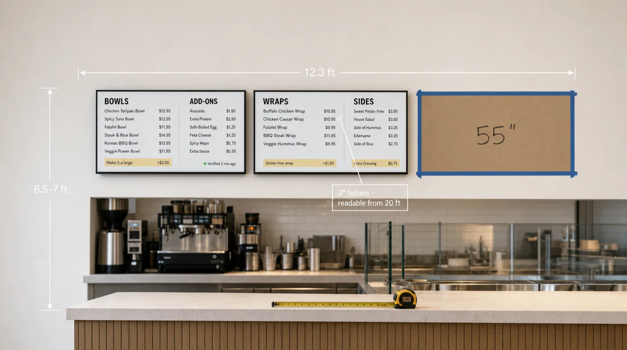
| 55″ | 8.2 / 4.7 ft | 12.3 / 7.1 ft | 16.5 / 9.5 ft | 27.9 / 48.7 in |
| 65″ | 9.7 / 5.5 ft | 14.6 / 8.4 ft | 19.4 / 11.2 ft | 32.8 / 57.6 in |
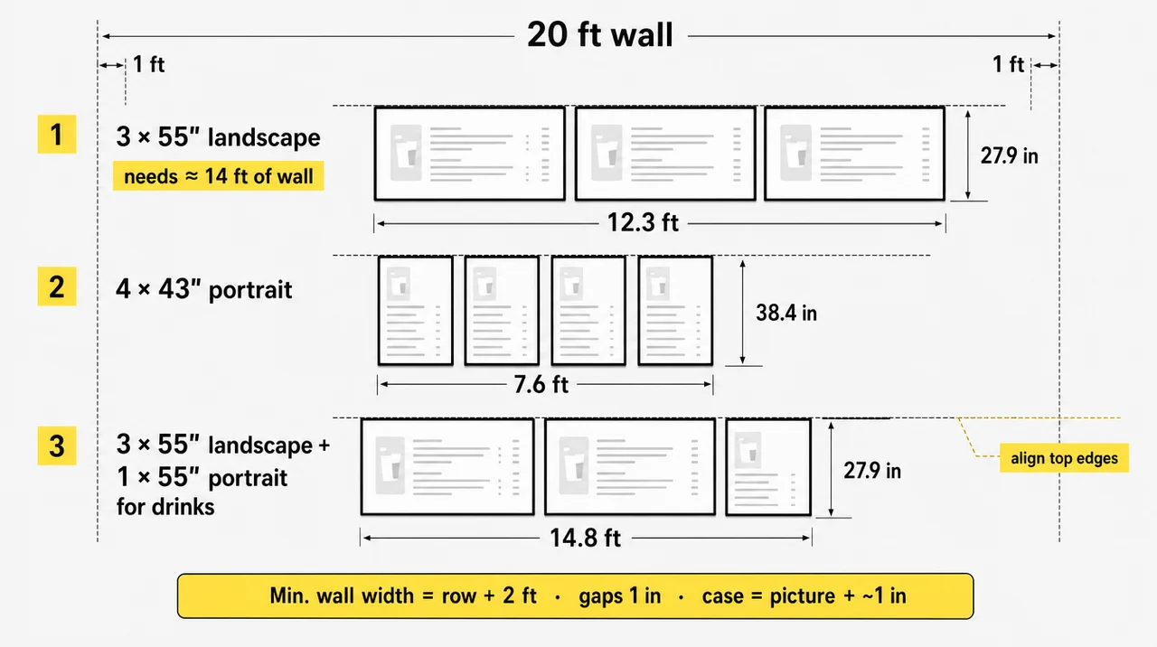
Add about 1 foot of clear wall on each side so the row does not touch a corner, a hood or a door frame. Three 55-inch screens in landscape span about 12.3 feet, so the wall needs roughly 14. Four 55-inch screens in portrait take only 9.5 feet of width, but they stand 4 feet tall, which brings ceiling height into play in the next section.
A straight row fits most walls, but three other shapes work too:
- 2 × 2 block. Four 55-inch screens make a block about 8.2 feet wide and 4.7 feet tall. With the bottom at 6.5 feet, the top reaches 11.2 feet, so it needs a high ceiling.
- Mixed orientation. Three landscape 55-inch screens plus one portrait 55-inch screen for drinks span about 14.8 feet. Align the top edges so the row reads as one board.
- Stepped heights. Useful under a sloped ceiling or over a back counter with tall equipment at one end.
Whatever the shape, put combos and high-margin items on the screen the line faces first, and add-ons such as drinks and sides on the screen above the register.
Skip 32-inch screens for anything read from the line; they suit only spots where guests stand within about 6 feet. Before ordering, tape the outline of every screen on the actual wall, or hang cardboard cut to size, and look at it from the back of the line. Check the load as well: three 55-inch commercial screens at about 35 lb each put more than 105 lb on the wall before the rail, and each screen should come off for service without taking down its neighbors.
Menu boards built from one model number and one batch keep their whites matched side by side. The guide to the best TV for a restaurant menu covers panel type, brightness and screen class for that row. Next comes the number of items each of those screens can carry.
How Many Items Fit on Each Screen Size
A 55-inch screen holds about 15 readable items per column at 8 feet, 10 at 12 feet, and 6 at 20 feet. Counts drop with viewing distance: the letter height that guests need grows with every foot. Same assumptions as above: one line per item, 1.6× line spacing, 75% of the height for the list.
| Screen, landscape | 8 ft | 12 ft | 15 ft | 20 ft |
|---|---|---|---|---|
| 32″ | 9 | 6 | 4 | 3 |
| 43″ | 12 | 8 | 6 | 4 |
| 50″ | 14 | 9 | 7 | 5 |
| 55″ | 15 | 10 | 8 | 6 |
| 65″ | 18 | 12 | 9 | 7 |
Two columns on a landscape screen double each number. In screens per menu, read from 15–20 feet on 55-inch screens:
- 20 items: 2 screens.
- 40 items: 3 screens at 15 feet, 4 at 20 feet.
- 60 items: 5 screens, or 3–4 screens with breakfast and lunch switched by daypart.
Photos and tickers cut the count. A landscape screen split half text and half food photo holds half the lines. A scrolling strip along the bottom costs one or two lines, and a calorie column on chain menus narrows each row by about 10–15%. Splitting menu boards by category, such as starters, mains and drinks, keeps each screen short enough to scan.
⚠️ “The more items you show, the larger the screen needs to be” is not true: from 20 feet, moving from a 55-inch to a 65-inch screen adds one item per column, while a second 55-inch screen adds six. More items call for more screens or a daypart switch, not a bigger diagonal.
Beyond the item count, mounting height decides who actually sees the bottom rows.
Menu Board Height: How High to Mount the Screens
Menu board height starts at 6.5–7 feet to the bottom edge, a height that keeps heads in line off the prices. Over a counter, US men average 68.9 inches in height and women 63.5 inches, according to CDC data from 2021–2023. Eyes sit about 4.5 inches below the top of the head, so a standing guest looks out at roughly 59–64 inches, and the heads in front of them end at about 5.3–5.7 feet.
A 55-inch landscape row with its bottom edge at 6.5–7 feet tops out at 8.8–9.3 feet. A 55-inch portrait screen at the same height reaches 10.6 feet, so under a 10-foot ceiling a portrait drinks screen above the counter works better at 43 inches, which tops out at about 9.7 feet. When the ceiling caps the row below 9 feet, that limit, not the distance, sets the menu board size: choose 43- or 50-inch screens and add one more to the row.
The upward angle tells you whether the height works. Signage guidelines treat about 15–20 degrees above eye level as the comfortable limit. For a 55-inch landscape screen and eyes at 62 inches:
| Distance to the board | Bottom edge at 6.5 ft | Bottom edge at 7 ft |
|---|---|---|
| 6 ft | 22° | 26° |
| 10 ft | 14° | 17° |
| 15 ft | 9° | 11° |
| 20 ft | 7° | 8° |
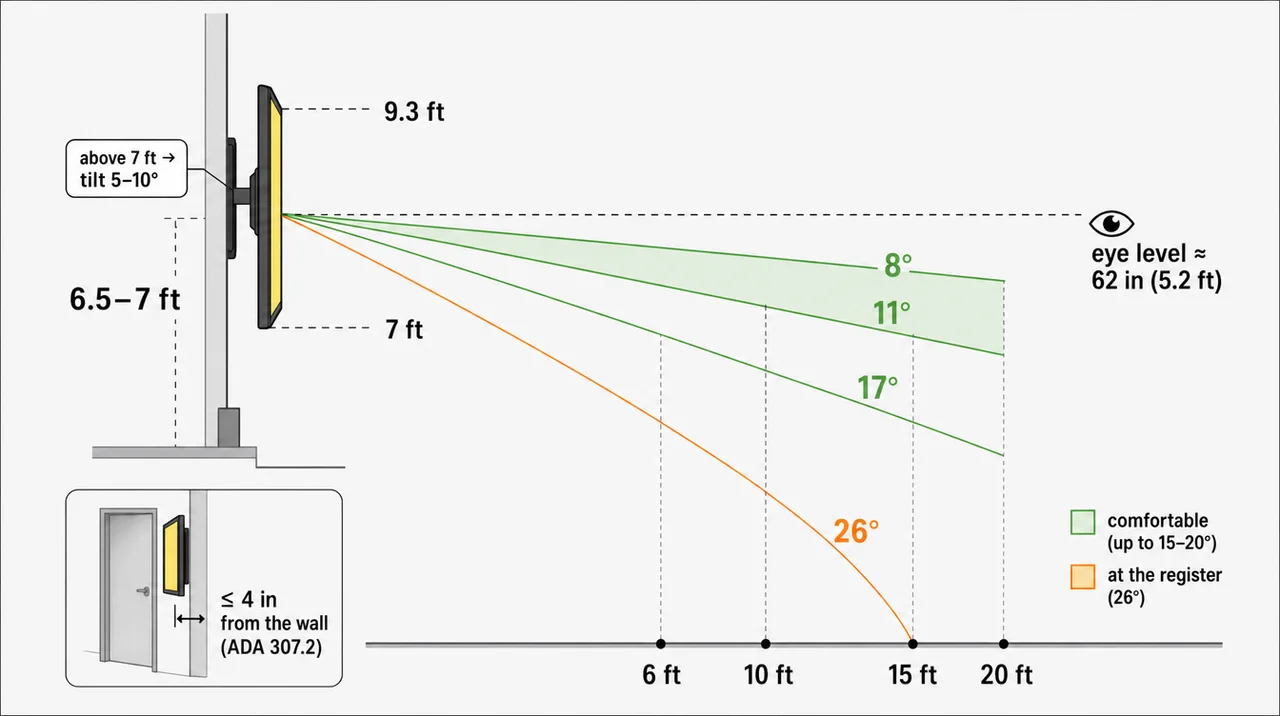
From the middle and back of the line the angle stays comfortable. Only the guest at the register looks up steeply, and by then that guest is ordering, not choosing. If the board must go higher than 7 feet, tilt the mount forward 5–10 degrees and keep the main categories off the top strip of the screen.
Three placement checks prevent most problems with menu boards over a counter:
- Glare. Look at the screen from the line with the lights on and the blinds open. A slight tilt usually moves a ceiling light out of the reflection.
- Heat and grease. Keep screens away from the fryer and flat-top exhaust, or put them in a sealed protective case, and leave air space behind a screen in a niche.
- Service access. Leave room to reach the HDMI port and power without moving equipment.
Screens at Eye Level
Eye level fits one place: a portrait screen beside the entrance or a pickup shelf, where nobody stands between the guest and the board. If that screen sits in a walkway, ADA rules limit how far it sticks out: an object with its lower edge between 27 and 80 inches above the floor may protrude no more than 4 inches into the path. A flat mount keeps a slim screen inside that limit; a deep tilting arm may not.
⚠️ “Mount the menu at eye level so nobody stretches their neck” is not true for a board above a counter: at about 5 feet the heads in line and the register block the lower rows. Eye level suits a portrait screen at the door, not the main row.
As a result, mounting height and viewing distance together decide the letter height.
Font Size and Letter Height for Each Distance
Font size for a digital menu board starts as letter height in inches and becomes pixels once you know the screen. Set menu board font size in that order: distance gives inches, and the screen’s pixel density turns inches into pixels. Measure the letter height for a menu board on capital letters, such as an “H”.
A Full HD screen fits 51 pixels into each inch of height on a 43-inch screen, 40 on a 55-inch and 34 on a 65-inch. A 4K screen doubles those numbers.
| Farthest guest | Letter height | 43″ Full HD | 55″ Full HD | 65″ Full HD | Font setting, 55″ |
|---|---|---|---|---|---|
| 8 ft | 0.8″ | 41 px | 32 px | 27 px | about 46 px |
| 12 ft | 1.2″ | 61 px | 48 px | 41 px | about 69 px |
| 15 ft | 1.5″ | 77 px | 60 px | 51 px | about 86 px |
| 20 ft | 2″ | 102 px | 80 px | 68 px | about 114 px |
| 25 ft | 2.5″ | 128 px | 100 px | 85 px | about 143 px |
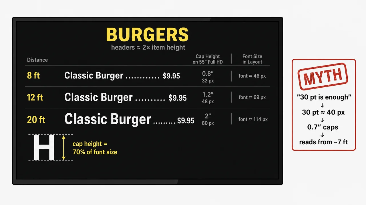
Design tools set font size by the whole type body, and capitals in common sans-serif fonts reach about 70% of it. Divide the pixel target by 0.7 to get the number you type into the font field.
Give each level of text its own font size:
- Category headers: about twice the item height.
- Item names and prices: the size from the table, same height for both.
- Descriptions: one or two steps smaller, because guests read them at the counter, not from the back of the line.
Use regular or bold weights; thin and script fonts lose strokes across the room. To test, print one column at full size and read it from the back of the line, or show the file on the actual screen at its native pixels.
ADA Table 703.5.5 adds a useful cross-check. ADA section 216.1 exempts menus from its sign rules, so this is a benchmark, not a requirement:
| Baseline above the floor | Viewed from closer than | Minimum character height | Farther away |
|---|---|---|---|
| 40–70 in | 6 ft | 5/8 in | add 1/8 in per foot beyond 6 ft |
| over 70 to 120 in | 15 ft | 2 in | add 1/8 in per foot beyond 15 ft |
| over 120 in | 21 ft | 3 in | add 1/8 in per foot beyond 21 ft |
A board above a counter almost always sits higher than 70 inches, so the ADA table asks for 2-inch characters, the same as the 10-foot rule at 20 feet. A menu board size chosen by the 10-foot rule already clears this benchmark.
⚠️ “Use a 30 pt font or larger” is not true for a wall menu: 30 pt equals about 40 pixels, which gives capitals of roughly 0.7 inch on a 55-inch Full HD screen. That reads from about 7 feet, not from the line. A point size means nothing until you know the screen and the viewing distance.
Calories and Contrast Rules for Chains
Chains with 20 or more locations under the same name and a substantially similar menu must follow the FDA’s menu labeling rules, 21 CFR 101.11, and these rules cover menu boards on the wall, printed or digital:
- Placement: calories sit next to the item’s name or price.
- Size: calorie type is no smaller than the name or the price, whichever is smaller, in the same color or one equally conspicuous, on a background at least as contrasting.
- Format: a column with the heading “Calories” or “Cal” is allowed.
- Rounding: to the nearest 5 calories up to 50, then to the nearest 10.
- Statement: “2,000 calories a day is used for general nutrition advice, but calorie needs vary.” sits at the bottom of the board in type no smaller than the smallest calorie number, along with a note that written nutrition information is available on request.
For contrast, WCAG asks for at least 4.5:1 for normal text and 3:1 for large text, where large means 18 pt or 14 pt bold. By pixel size, nearly every price on a wall board counts as large, so 3:1 sets the technical minimum. Aim for 4.5:1 anyway, because glare and distance eat contrast; WCAG’s enhanced level asks for 7:1. Next, those letter heights become a pixel canvas.
Digital Menu Board Resolution and Size in Pixels
Digital menu board resolution is the pixel canvas you design on: 1920×1080 in landscape, 1080×1920 in portrait, 3840×2160 for 4K. The first two are Full HD. Build every file at the exact resolution of the screen that shows it. Some budget and older screens run 1366×768, and a 1920-wide file scaled down to them blurs small type.
Full HD holds up on a 55-inch screen read from 8 feet or more; at that distance a single pixel is already at the edge of what the eye can separate. 4K pays off when guests stand closer than about 6 feet or when the board leans on food photos.
For a row of screens, pick one of two approaches:
- One wide canvas. Three landscape screens become one 5760×1080 file, cut into three 1920×1080 parts. Lines and photos flow across the row.
- Separate files. Each screen gets its own 1920×1080 canvas in landscape, or 1080×1920 in portrait, and its own category. The same promo file can repeat on more than one screen.
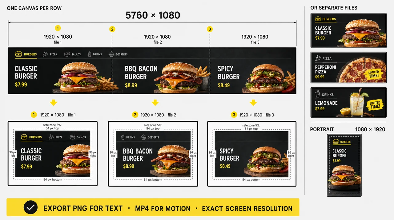
Keep text and prices about 5% inside every edge of the canvas, in pixels: roughly 96 pixels left and right and 54 pixels top and bottom at 1080p. Bezels hide the edge in a row, and TVs with overscan crop it. Export text-heavy menu boards as PNG and motion as MP4 at the same resolution.
⚠️ “The sharper the display, the smaller the text can be” is not true from the line: at 15–20 feet the eye reads letter height in inches, and 4K only spends twice as many pixels on the same 2-inch letter. A 0.8-inch price stays unreadable from 20 feet on any resolution.
Overall, the canvas follows the screen, and the screen follows the farthest guest.
When a Bigger Board Won’t Help
Bigger screen sizes stop paying off in four situations that come down to a distance, an item count or a wall width. If nobody reads the board from farther than 6 feet, as at a pickup shelf or a service window, a 32–43-inch screen already holds 12–16 items per column and a 65-inch one only adds wall. If the menu runs past 40 items, a 65-inch screen read from 20 feet adds one line per column over a 55-inch, while a fourth screen or a daypart switch adds a dozen. If the wall is narrower than the row plus 2 feet, for example under 14 feet for three 55-inch screens, switch to 43-inch screens in portrait or drop one screen. And if guests order at the table on a 7–10-inch tablet, or a 10–12-inch one for a shared table, the wall board only carries promos, so menu board size stops mattering and one screen of any size will do. In other words, the money for extra inches works harder as an extra screen or a clearer layout.
How Decker Fits One Menu to Any Screen Size
Decker splits each screen into zones and can run one layout across a wall of 4 screens, in landscape or portrait. Any menu board size works, because you decide which zone shows which category, from a single 43-inch screen at a café to a four-screen row at a QSR counter. Each screen can also get its own file when you split the row by category.
The Android media player for menu screens plugs into any TV with HDMI, so the sizes you chose above stay yours. A price change reaches the screens in 1–5 seconds, and on the Professional plan prices sync from Toast, Square, Clover or an Excel sheet, so the layout and letter sizes stay fixed while the numbers change. For a group of locations, one display standard applies across the network, and updates go to one location, a group, a region or every store at once.
Questions and Answers
1 What size TV should I use for a menu?
Pick the screen size that matches the farthest guest. A 43-inch TV covers a line up to about 12 feet deep, and a 55-inch one up to about 25 feet; beyond that, add screens or go to 65 inches. To decide what size TV to use as a menu board for a full counter, count items too, then check the best TV for restaurant menu setups for panel, brightness and screen class.
2 Is there a standard size for wall menus?
No single standard exists. The most common menu board size for indoor counters is a row of 43-inch or 55-inch screens, three or four across. Printed wall menus usually run 24 × 36 or 36 × 48 inches.
3 How many screens does a counter menu need?
Divide the item count by what one screen holds at your viewing distance. A 55-inch screen with two columns carries about 16 items read from 15 feet and about 12 from 20 feet, so a 40-item menu needs three or four screens.
4 How big should menu text be from the line?
Plan 1 inch of capital-letter height for every 10 feet: 1.5 inches at 15 feet and 2 inches at 20 feet. On a 55-inch Full HD screen, 2 inches equals 80 pixels of capital height, or a font setting of about 114 pixels.
5 Can I mix screen sizes or orientations on one wall?
Yes. Three landscape screens with one portrait screen for drinks work well, and so does a 2 × 2 block where the ceiling allows it. Keep the top edges on one line, use the same model for screens of the same size, and repeat the same letter height on every screen.